 WELCOME TO THE DESALL BLOG. THIS POST IS PART OF THE “COMMUNITY SPOTLIGHT” SERIES WHERE WE INTERVIEW THE BEST MEMBERS OF OUR CREATIVE COMMUNITY. THANKS FOR READING!
NOTHELFER is a design duo bringing together new technologies, design, art and cultural heritage. Based in Germany, Stefanel & Silvia Barutcieff have won several Desall competitions and gained impressive experience working for brands such as BMW, Mini and Samsung. In this interview, they talk about the challenges of managing complex briefs and designing a permanent museum exhibition. The interview has been lightly edited for length and clarity.
Hello you two! It’s great to have you here today. Can you briefly introduce yourselves to the community?
Hi, this is Stefanel, I’m a Senior Designer from Romania, and this is Silvia, a Scientific Researcher and the other half of the Nothelfer duo. We currently live in Munich, Germany, and our expertise lies in product design, installations for museums and fairs, and user interfaces. Most of our projects use technology to create new types of user experiences with distinct emotional and interactive components.
Nothelfer has won several Desall contests so far. Which competition was the most exciting for you?
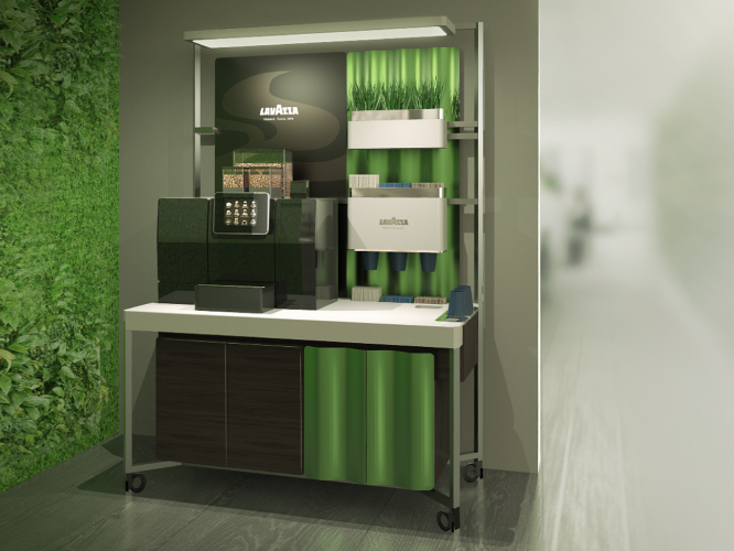
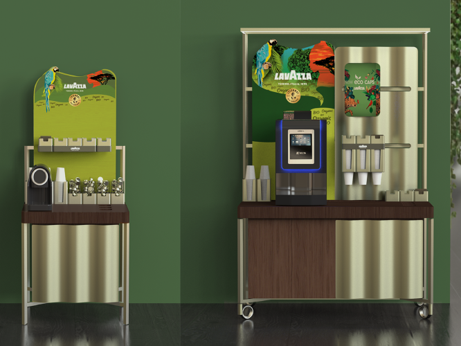
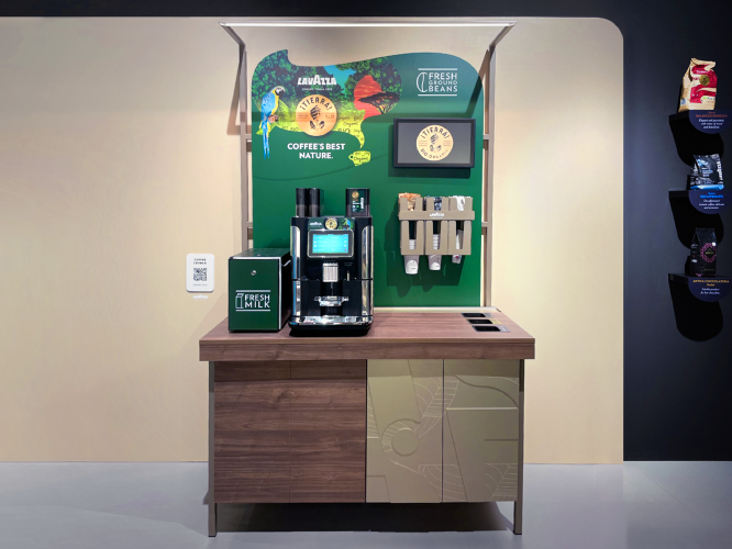
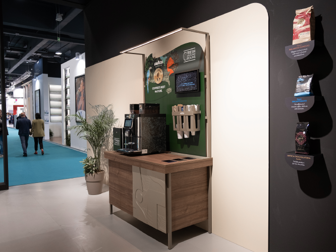
We’ve had a lot of fun working on all the Desall competitions so far. The “Lavazza Smart Coffee Corner” contest was particularly exciting as our proposal was developed into an actual prototype that was presented at Venditalia 2022, one of the biggest trade shows in the industry. When working on the original project for the new Lavazza coffee break area, the original intention was to create a modular design that could be adapted to different sizes and locations, bringing together all the different components in a unified look with a clear message (Green Hub, see the gallery at the end of the interview).
In the Lavazza challenges, you successfully delivered concepts for different product collections while maintaining a consistent “family feel”. What is your advice for working on such complex briefs?
Designing for a family of objects and managing complexity are some of the most difficult tasks for us, as a good design has to meet all the requirements of the brief and parties involved. We strongly believe in user-centred design to find the best solution for the end customer, but at the same time, the solution has to meet the client’s expectations, integrate well with their portfolio, take into account their brand values, target production costs, distribution channels, etc. Therefore, we usually start by generating multiple solutions. This is done intentionally to avoid settling for a solution that seems to be a good idea at first glance but ultimately cannot meet all the client’s requirements. Instead, we methodically go through the list of requirements and see what can be adjusted in each solution. Sometimes working on certain aspects of a particular solution can lead to major changes being made to other parts of the same design, which in turn need to be readdressed. It’s a lot of work, but if some of the concepts don’t seem to fit in the end, we just drop them and start looking for better ideas. That’s actually the most interesting part for us: finding the most promising design that solves all the challenges of the brief in a harmonious and elegant way.
In addition to industrial design, you are also active in the field of culture and museum installations. Is there a particular project you are proud of?
That would be the permanent exhibition of Museikon in Alba Iulia (Romania), a museum dedicated to Transylvanian icons and ancient religious books. The challenge was to find a balance between effectively explaining icons (their origin, role, artistic aspects, etc.) to a wide range of visitors – especially the tech-savvy younger generation – and avoiding cultural slights that could be taken as offensive. After qualitative interviews with young museum visitors, curators and icon specialists, we developed a design concept that invites users not only to passively view the exhibits but also to interact with the content, while preserving the original sacred aspect of the icons. One of the installations, located at the entrance of the museum, for example, is inspired by a widely used iconographic theme, the “Virgin of Mercy”. By reflecting themselves in the image under the arms of the stylised silhouette of the Virgin Mary, just like the painted people in the original representations, visitors “enter the world of icons” and are under divine protection. The installation also serves as a communication opportunity, offering the possibility for selfies and sharing on social media.
Recommend a book or resource on design/creativity that you would not want to live without.
We mainly use digital resources for inspiration these days, e.g. Pinterest, design blogs like Designboom, UX, forums like UX Collective and also more art-oriented ones like Mymodernmet. Last but not least, we are passionate museum visitors and therefore have a large private archive of images from our visits – a very inspiring resource.
The designer/architect you admire the most.
There are many, but we do not have an absolute favourite. In product design, we admire the approach of Nendo, Enzo Mari, and Konstantin Grčić.
Where can we find you online?
Our work is accessible on the official Nothelfer website.
‘GREEN HUB/SMART COFFEE CORNER’ by NOTHELFER (images kindly provided by Stefanel Barutcieff and Lavazza).
JOIN THE COMMUNITY, ENTER OUR CREATIVE CONTESTS!
 Follow