The global house-store, the interior design contest by Malìparmi, has just received the final selection from the Maliparmi Team for the 5 projects that will be awarded. The contest was looking for original concepts to employ for their stores all over the world, recreating the cozy atmosphere found at home and trying to combine craftmanship with technology. Altogether, 182 interesting projects have been submitted by more than 175 creatives from our international community.
The Winners
1st Award
madsoart aka Beatriz Madrigal Sotos
with
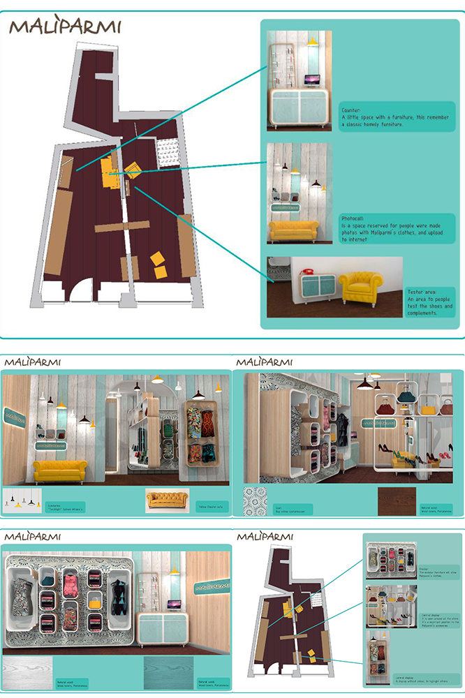
Square in the square
“It is an original concept where the home concept is transferred into a store that highlights the materials and the craftsmanship of the interiors employed.
Even if recalling the smooth shapes of the niches found in the old concept, there’s a cozy atmosphere that is nevertheless modern and contemporary.
It is particularly balanced in the choice of the displays.” – Maliparmi Team
The concept of the store is an innovative concept, with classic elements. The square module will have a great importance throughout the project. It is tried to get a smart as well as homely desing. This was achieved interchangin classics elements such as chester couch (furniture fashion now), with actually elements such as Sylvian Willenz´s luminaires “Torchlight”.
It is used natural wood as main material, combining diverse colours (it is based on the Nordic design, blues and browns tones). The colours are choosen in a soft tone, because clothes and complement will gone colour enough to the store.
It is chosen a modular furniture, own design, that will be distributed around all the shop. Ane of the modules, the biggest, are coated with fabric. It gone the possibillity to change the store aspect with a simple moviment, according to time of year or the mood you want to show.
It is elaborated two spaces to peocple can sit and probe the complements, and also, it will be a photocall to people do photographs, and upload to social networks, a new publicity form to the store.
2nd Award
marta.matte
with
Behind the curtain – MALIPARMI CONCEPT STORE
“A concept well balanced between craftmanship and technology.
The employment of interiors different in syle and materials has been really appreaciated. Great attention is given to detail.” – Maliparmi Team
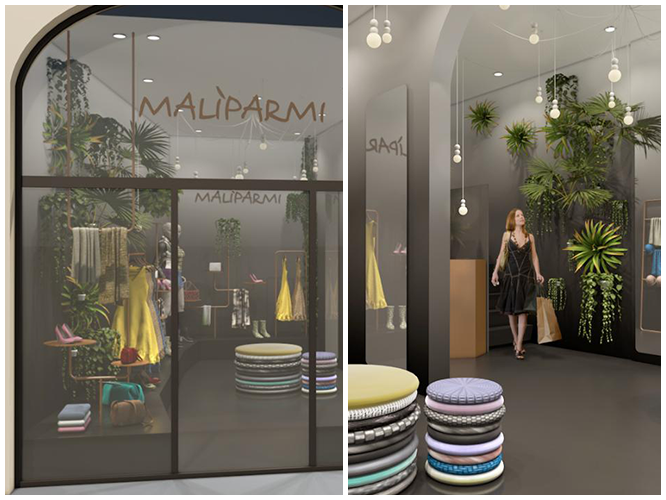
Go shopping and feel at home. The store concept try to adapt to different locations taking as characteristic elements recycled objects, wrapping the atmosphere in sheer curtains through which spy inside the store from the windows.
3rd Award
Studio Alagic aka Dijana Alagic
with
Maliparmi global house store
“Internationally driven concept.
A layout apt to be dynamic, as it is made of easy to move and lightweight structures that give maximum visibility to the products. ” – Maliparmi Team
A casual atmosphere that is open, inviting, elegant, innovative and fresh…
The main goal is to highlight Maliparmi’s collection with a unique atmosphere. We have achieved this by using lightweight display elements made out of copper, high-end technology; such as magic mirrors, WIFI, social media and apps. Malipharmi new store is a place where technology meets craftsmanship. The array of materials used in the interior is concrete, copper, MDF (painted black), glass and recycled textiles. Vertical garden features and fragrant plants will help to maximize the user experience. Handcrafted lightweight displays will elegantly present every product as if it is a small piece of jewellery. The hand crafted display units are also very efficient, easy to move and to install. All the lightening will consist of LED’s.
There is a basic podium where the products are semi-permanently attached. You can change these depending on what collection you desire.
We have created a casual atmosphere that is open, inviting, elegant, innovative and fresh, where representatives can share the story of the brand as well as engage in social events and presentations with visitors.
4th Award
gioross aka Giovanni Rossi
with
My Maliparmi
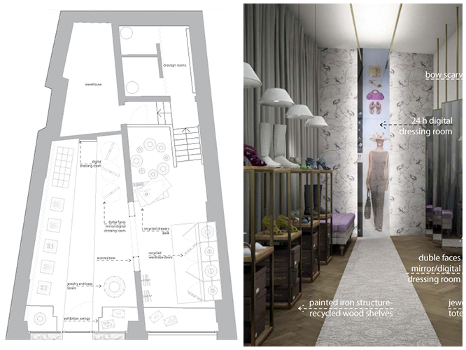
“A cozy atmosphere concept, where the wardrobes play the main role, recalling the wardrobes found at home. Warm environment where the craftmanship of the displays is highlighted. A very refined choice has been made in the material combinations: wood and wallpapers.” – Maliparmi Team
Warmth of the wood where natural materials are the masters.
5th Award
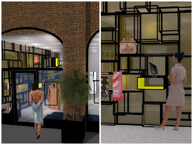
“The display area has been really appreciated, a modern reinterpretation of the bookshelves actually employed in the Malìparmi monobrand stores.
Lightweight and elegant structures, for both shapes and materials, allow to exhibit a wide range of accessories typologies.” – Maliparmi Team
This design is a combination of architecture, color and material. The light is fundamental to this combination. The architecture of the store has been studied determining the hot and cold points, waiting to make hotter the cold ones, and giving points of interest for the client throughout the whole store.
Steel has been selected as the only material and using a cube as the main shape, a reticulation with volume has been built so that the client can wait for his product.The rest of the store exposes the products in a secondary way.
The aesthetic of the space is bare, neutral, hot yellow touches have been added in some points in order to provide the perfect backdrop for the Malìparmi products.
Technology has been introduced through some ipads with bar detector that recomend the clients change the clothes they like.


 Follow
So disappointing. except of 3rd (Studio Alagic aka Dijana Alagic), these selected works don’t have the vision or even a truly concept, and i feel sorry for maliparmi and juries. there were so many better designs that deserve to be on that list.
That’s a big disappointment… the winning project is awful! where is Technology? Styling, color scheme and cosy home atmosphere are more than questionable…
I love the winner project! I want my house look this