The success of a packaging design depends on different aspects. We collected a short list of interesting and successful examples of packagings to take into account when you will get down to “Wrap the Music” or similar contests.
“Give it a second life”
Nowadays consumers pay more and more attention to eco-sustainability. Usually packaging is accused to be an example of waste of material, so using recycled materials and thinking about the “second life” of the packaging will give a “green” appeal to your design.
Nutella® – Ferrero
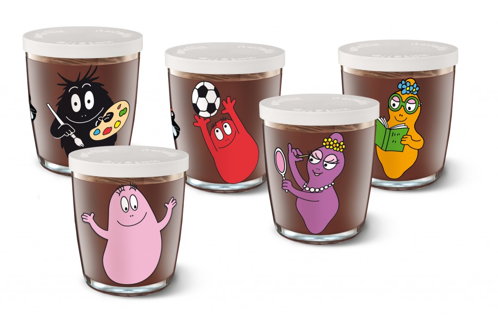
An evergreen packaging, loved by children and parents: once you finished the cream, you can reuse the glass. The graphics are different every year, and it’s hard to resist to the temptation of collecting all of them!
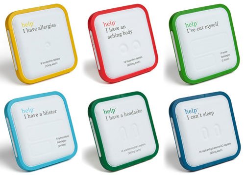
Help! I have problems – designed by Design Within Reach
Honestly, a bright idea! The set is designed to be easy to use: you can bring it with you and easily recognize the remedy necessary in each situation. The design is essential and colorful, and the cases are made of biodegradable paper pulp with rims made of biodegradable PSA bio plastic, a corn-resin byproduct.
“Brand communication”
Packaging is a matter of communication, and as a brand communication vehicle, the designer has to focus on how to deliver the message or the story.
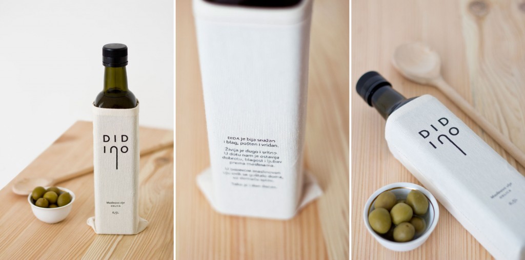
Didino – designed by Manasteriotti Maric
This packaging has been created for a limited edition olive oil and the communication is centered around a grand daughter’s story of her grandpa. She named the oil Didino as her Grandpa’s, and within the sentimental story about him and his olive orchard, she talked about the large jute sacks he would carry when going to collect the olives. Taking this as starting point, the design was silkscreened onto a textile that reminded of jute material, the logo is based on her grandpa’s walking cane and on the back there is the brief story.
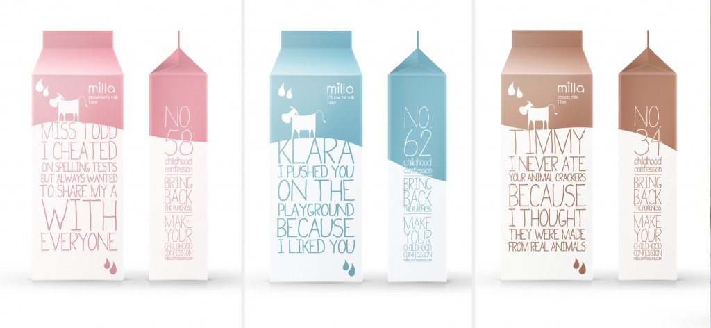
Milla childhood confessions – designed by Christy Srisanan and Erick Barrios
There’s nothing purer than a child and Milla knows it. That’s why they built their brand upon this truth. This packaging shows childhood confessions and makes us go back in time. Milla brings back the pureness by encouraging people to go to millaconfessions.com and share their innocent memories.
“Thinking outside the box”
One of the most effective way to attract people and made them talk about your product is creating a packaging surprising and breathtaking, something you have never seen before. Play with the material, the shape, the concept itself to create something with a great visual and emotional impact.
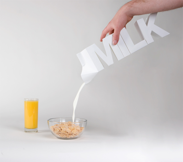
Milk – designed by Julien De Repentigny and Gabriel Lefebvre
It represents the content of the product in the simplest way, both through word and image. The packaging is the same dimension as a 2 liter milk carton.
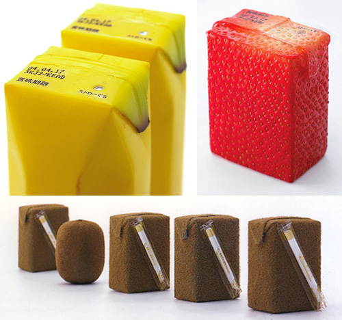
Juicy Skin – designed by Naoto Fukasawa
A famous example of packaging design in which materials and surface effects work together to communicate, through the senses, the content of the packaging.
“Make them smile”
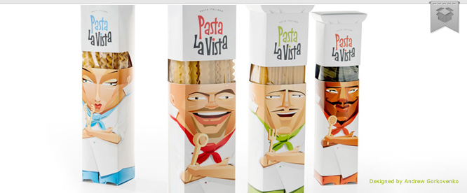
Playful and funny packaging designs improve the chances of the product to be noticed and remembered. The most typical examples are amusing faces and characters, but there is no limit to imagination in this field!
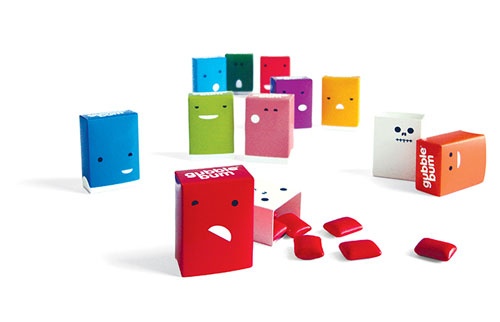
Gubble Bum – designed by Jesse Kirsch
Packaging design concept for a fun and twisted bubble gum brand. Beneath the cutesy, colorful exterior lies an unexpected twist: removing the outer box reveals the skeleton of each “bum.”
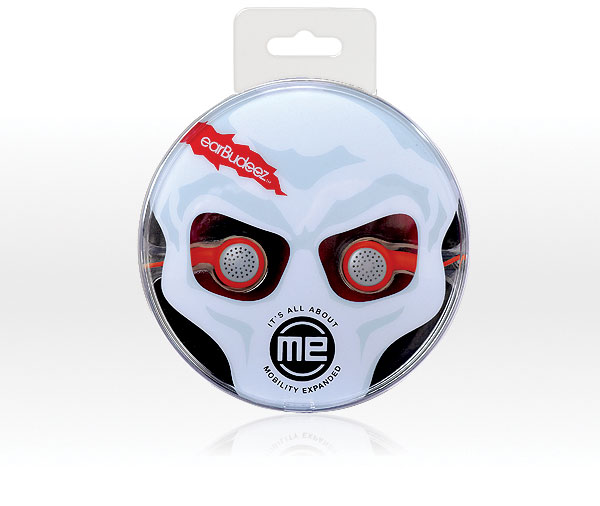
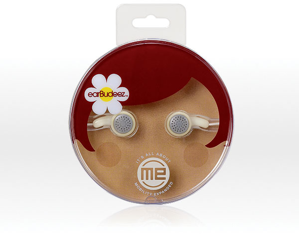
Earbudeez – designed by JDA
Audiovox found that customers choose their earbuds like a fashion accessory and packaging is key to their choice. JDA developed the earBudeez series as personalities with the earbuds as eyes in different positions to convey attitudes and emotions. These fun, eye-catching packages appeal to customers of all ages who want to express themselves with a unique product.

 Follow