 We are glad to announce: “we have a winner!” Actually, we have three! After the very hard task of evaluating all the 314 entries that you have submitted, Elica has finally come with a response. Out of all the 193 participants, three have most of all caught their attention for one reason or another.
The call was pretty broad: reinvent the cooking hood designing a new concept that breaks with the past, exploring new shapes, colours or geometries with an important focus on the user experience. Still we were aware that the cooking hood was not a topic that many designers actually try out, but you simply exceeded any possible expectation! Thank you!
So let’s greet the winners and the comments by the Elica Team.
The gallery on Desall.com will remain private except for the winning proposals which will be published only in this post.
The Winners
1° Award
 iwednesday aka Tony Badu
http://iwednesday.co.uk
with
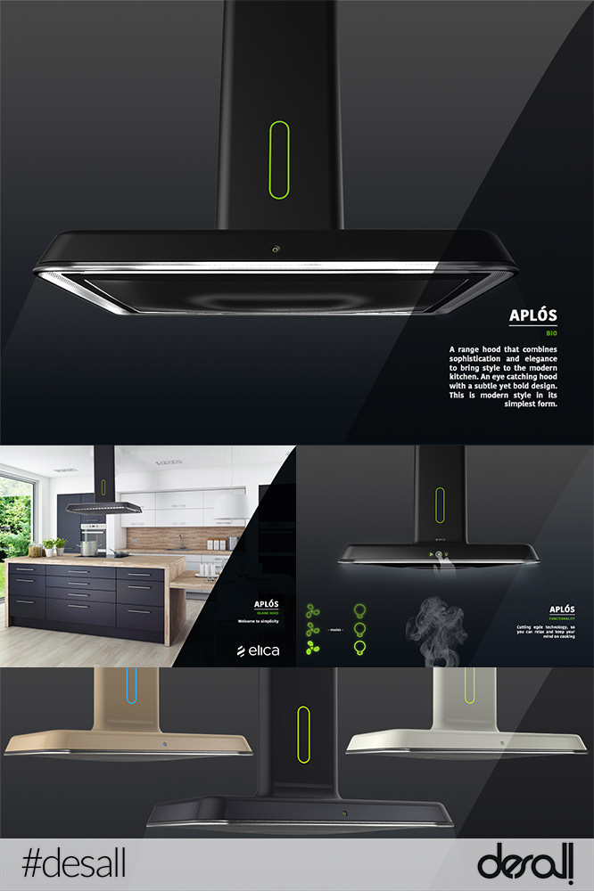
aplos
This project distinguished itself for succeeding in turning a classical piece like the T Shape (or upside-down T) into a technological product, with a very strong appeal without compromising the lines which are both rigid in the structure and soft in the details. The idea of an original chimney, very slim and designed to become an attachment of the main body gives the product a hi-tech spirit. The attention to detail and to the proportions makes it a winning idea. – Elica Team
Aplós – The hood range with simplicity at heart. By combining two stylish materials, the Domed vent and elongated shaft of aplós make it a great addition to any kitchen.
Features
• LED ambient lights from vent grill area
• Carefully designed Hidden vent area
• Simple unobtrusive interface
• Metal main body with a glass trim
• Domed vent to bring continuity to the design
• Various colour combinations.
2° Award

AntonioLanzillo
http://www.antoniolanzillo.com
with
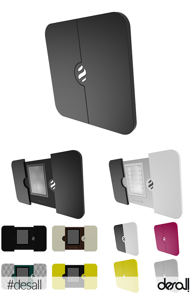
SLIDING DOORS
He managed to reinterpret the “vertical” cooking hood in a new and original way. Unexpected, surprising and with essential lines. The Elica logo, used as the key for the whole aspiring system, which gives access to its functionalities, makes this concept even more fascinating. The design of the product is also very apt for customisation and combination of different finishes. – Elica Team
Hood with automatic movement.
3° Award

elena.paoletti.91
with
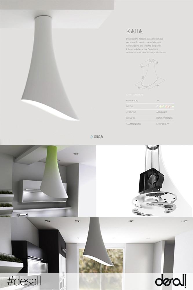
KAllA
It distinguished itself for the simplicity of its lines, succeeding in creating an object that, even if really characterising and with a strong identity, manages to perfectly blend in the surrounding environment with discretion. A product that plays with the formal emotion, leaving out – at least from a perceptual point of view – any technological content. An asymmetric line wisely controlled to reach an excellent formal balance. – Elica Team
Floral Inspiration
Sinuous and elegant
Heart of the kitchen
Soft light
Thermoformed ABS.
Many congrats to all! Now we are all looking forward to get a new hood, right?
We’ll keep you posted about their development! Stay tuned!!!
![]()


 Follow
Hello Desall Team
I have read the characteristics of all the winning designs.
But they did not fully match the demands of competition criteria if Possible for you or ELICA please write reasons
SELECTION on this blog?
Regard
Mostafa
Hi Mostafa,
thanks for your feedback. If you wish, you can have a look at the comments by Elica above each project image, explaining why they have selected those projects.
Have a great day!
… Bravissimi, tutti e tre i progetti, sono un’eccellenza di design!!!
I am curious, what is the point of hiding the gallery of all the other competitors after its been published? It’s already been in the public domain for several months, so surly if a competing company wanted to steel some of the ideas they would have seen them by now.
I am already aware that the client posting the completion can come back later and license additional designs but again, its already been public and besides, if they really wanted to come back later, chances are they would have jumped on the design as an additional option during the jury selection process.
To me, I would think it would be of great benefit to leave them public so that the designers can see what they were up against after the decisions were made.
Dear Giovanni,
thanks for your comment. The competition started with an open gallery, to allow anyone inspire and get inspired by each other, so as to be able to develop even more innovative projects. Once the contest is over, the company has still 12 months of option right on all proposals which is why the gallery is now private. It is a request of the company to further protect the proposals through this period.
Regards
I agree with the other people here, 2nd and 3rd winners are innovative but 1st place seems to be a simple update. I don’t see anything innovative about it. The Elica design team states detail and proportions as it key points. In other words, styling. That is OK if that was what they were looking for, but there is no NEW CONCEPT here, which is what they stated they were looking for in the first sentence of their own design brief.