Welcome back to our monthly update with the best designers of our Community. This September we have some great new faces!
See who they are and check out their works.
If you also want to be part of our Spotlight, you just need to show us your creativity. Join the contests and give your best!
RomenDesign aka Raúl
senior designer
http://www.romendesign.nl
I have multidisciplinary experience with national and international clients in various design disciplines from conceptualization to implementation of campaigns, from logos to corporate identities, from television to websites, from packaging to retail and from small customers to AA brands.
Some works:
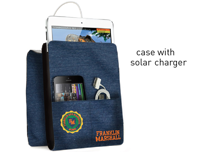
Sweatshirt fabric case with a solar charger system
This is a sweatshirt fabric case for ipad, iphone, headphones, charge cables, pen, etc. with a solar charger.
The cable is connected to the solar charger while using the tablet, iphone or tablet.
The case is also used as a support to place your tablet/ipad/iphone.
You can study or listen to your music or see your favorite videos outside at the same time your iphone/tables/ipad get charged with this solar charger system.
This device matches with the F&M philosophy “lifestyle, oriented to innovation, sport, culture and music”.
College, innovation and lifestyle come together on this idea!
Fresh&Juice
Corporate identity for a Spanish fruit export company with a quality, fresh and modern look.
The “&” is an icon in the form of an orange. Easy to apply in both names and possibly for future new businesses.
Giuliabavagnoli aka Giulia Bavagnoli
graphic designer
http://be.net/giuliabavagnoli
Some works:
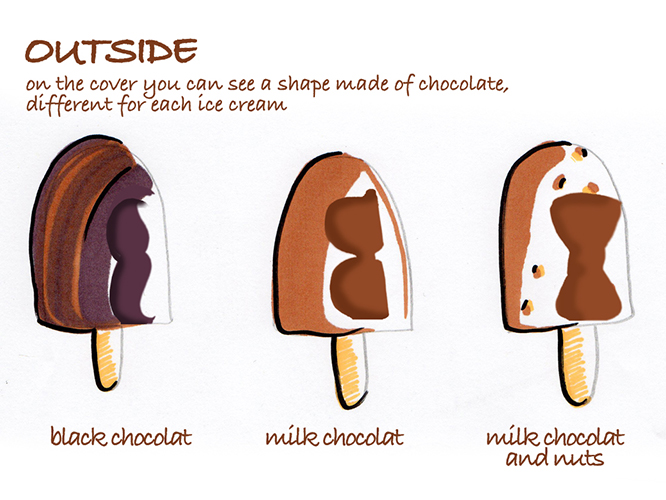
Eat and share
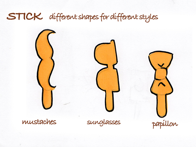
Wear the stick and share picture with your friends!
1- Enjoy the ice cream.
2- Discover the stick shape.
3- Take a picture of you and your friend wearing the stick.
4- Share your photos with the community!
5- The best picture win a prize!
MaBi aka Marta
student
Some works:
Chandra
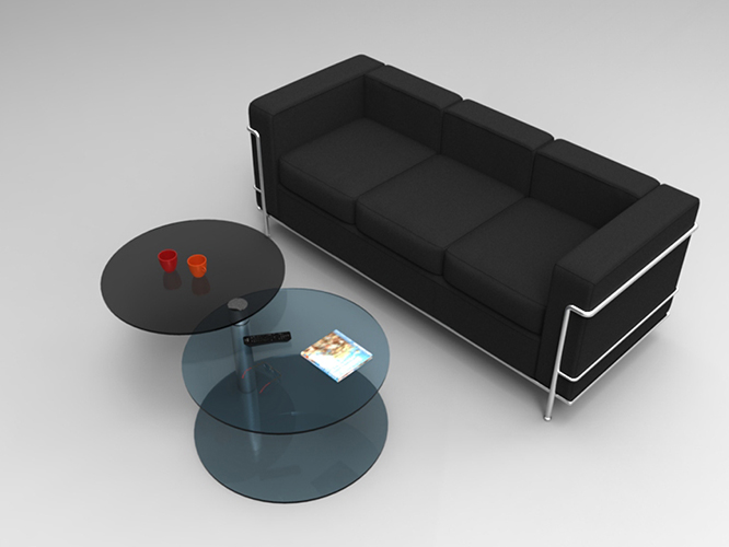
The aim was to design an elegant coffee table using flat glass and aluminum. The main inspiration has been the phenomenon of eclipse, when the sun is obscured by the moon. Hence the name “Chandra”, the Hinduist lunar deity. The black circle symbolizes the moon and the white one the sun.
The two circles are connected by a pedestal. The last part of this pedestal is movable and this mechanism allows the black glass to rotate. This movement symbolizes the approach of the moon to the sun during the eclipse. The different diameter of the clack and white circles creates the thin halo that we see during this phenomenon.
Chandra is made of flat glass and aluminum. These two materials are simply pasting together. Inside the pedestal there is a swivel that allows the dark circle to rotate. The circles have the thickness of 10 mm and they are obtained cutting a glass plate.
The perfect match between these materials enhance the grace and the elegance of this coffee table.
Calì
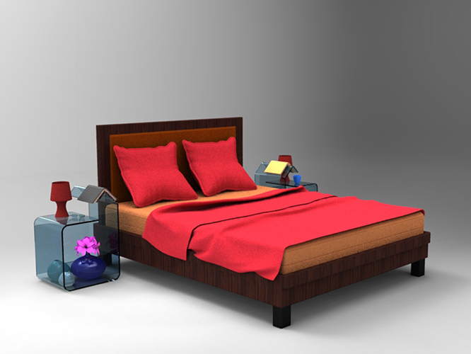
The aim was to design a sophisticated night table using glass. The main inspiration has been the direct observation of a daily gesture.
Calì is a night table thought for all those who like reading in bed. It has an angled shelf designed to hold books or magazines. This form facilities the placement of the readings and works as a bookmark.
All the table is made of glass with a thickness of 10 mm. The two rectangular components are pasted on the main structure.
ZinghDesign aka John Huizingh
engineer
http://www.zinghdesign.nl http://grabcad.com/john.huizingh/
I am a professional concept design engineer with 15 years experience in design/engineering of products in several materials (plastic, metal ..). I use handsketching and photoshop as a starting point.
Some works:
DragonFly
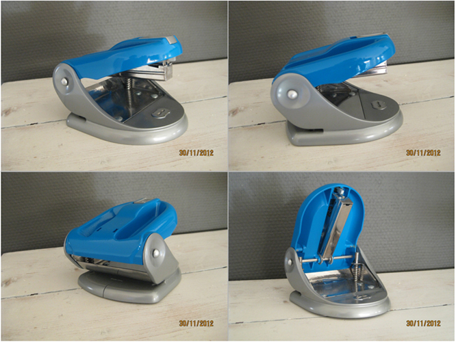
Combination of a stapler and puncher. Functioning of both parts stays the same.
Innovative combination of stapler and puncher which both use the same rotating axle. Puncher is on one side and stapler on the other.
Fully working prototype available. Pictures of prototype added.
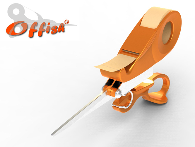
Offish
OFFISH is a innovative combination of a stapler, scissors and a tape-dispenser. In the first sketches of the product it looked like a swordfish. Therefore FISH and OFFICE becomes OFFISH.
OFFISH replaces 3 stationary products on the office desk. These 3 products are replaced by a cool looking item.




 Follow